
The Exact Paint Colors We Used In Our Warm, Earthy Home
One of the easiest ways to transform a space is with paint, and over the years, we’ve selected colors that bring warmth, character, and cohesion to our home. Whether you’re looking for inspiration for your own space or just curious about the shades we’ve chosen, I’m sharing a full rundown of the paint colors in our home.
My Go-To Neutral White
Pure White – Sherwin Williams
This is the white we’ve used throughout most of our home. It’s the perfect neutral—light and makes any space feel bright without feeling cold or sterile.

The Perfect Warm White
Shoji White – Sherwin Williams
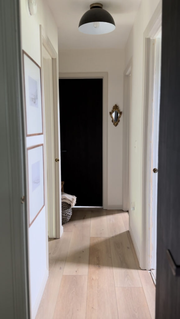
Shoji White is the warm white I chose for our fireplace and upstairs hallway walls, and it has quickly become a favorite in our home. This creamy, greige-toned white strikes the perfect balance between warm and neutral, creating a cozy and inviting atmosphere. It pairs beautifully with the Evergreen Fog in our family room. I used Accessible Beige, also a Sherwin Williams color, for the door trim and baseboards in the hallway, and I love how Shoji White looks warm in both spaces without feeling too brown or yellow tinged.

The Green I Tell All My Friends About
Evergreen Fog – Sherwin Williams
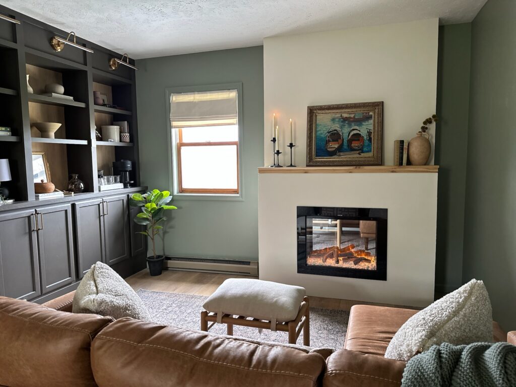
I knew the first time I saw a picture of this color that it needed to be the paint color for our family room. It is a beautifully muted green with gray undertones that create a soft, organic feel. I love that it brings a sense of calm and warmth, making it perfect for my desire to have a cozy upstairs retreat in our home. Evergreen Fog pairs so well with the wood tones in our flooring, the warm neutral of the fireplace, and the darker paint color of the built-ins in the room. No matter the time of day, it feels like a cozy, peaceful retreat.
Our Moody Living Room
Hague Blue – Farrow & Ball
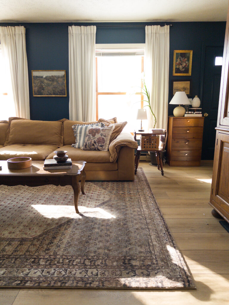
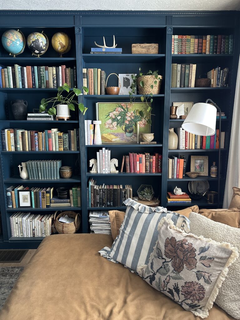
This was the first paint color I chose for our home, and when we moved in, I painted an accent wall in our living room this deep, dramatic blue. After a couple of years, I decided the whole room needed to be painted this color. And then when I built our library built-ins, I drenched them in Hague Blue as well. This moody hue shifts beautifully depending on the light; it looks like different colors from morning to night. But it never stops making the room feel cozy. It was a bit of a bold choice to do the entire room this dark blue, but one I’m glad I made.

My Most Asked About Color
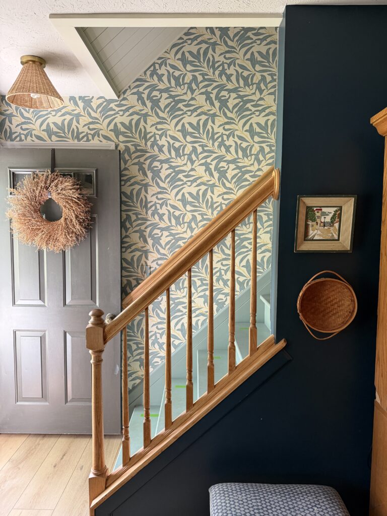
Urbane Bronze – Sherwin Williams
If you’ve ever doubted that light makes a difference in how color looks in a room, let me introduce you to Urbane Bronze. The chameleon of all color, I used Urbane Bronze on our family room built-ins, where it pulls brown. I also used it on our front door, and it looks like a charcoal gray. Look at the two pictures below – I promise, they are the same paint color!

Guest Bedroom Green
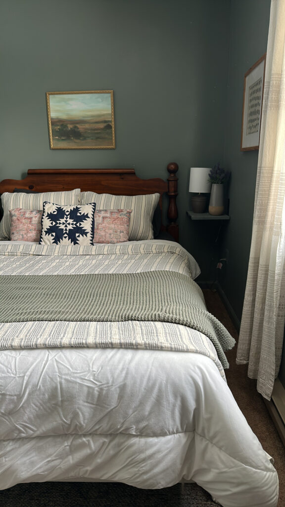
Taiga – Sherwin Williams
This color wasn’t on my radar at all, and I picked it from a paint chip on a random trip to the paint store. Taiga is a stunning darker green with a hint of gray, creating a rich, earthy feel that brings the outdoors inside. I chose Taiga for our guest bedroom, and it instantly transformed the space into a calming, grounded retreat. This color works beautifully with warm wood tones, brass hardware, and soft neutral accents. I consider using it in other rooms of the house any time I walk past this room!
Our Blue Bathroom
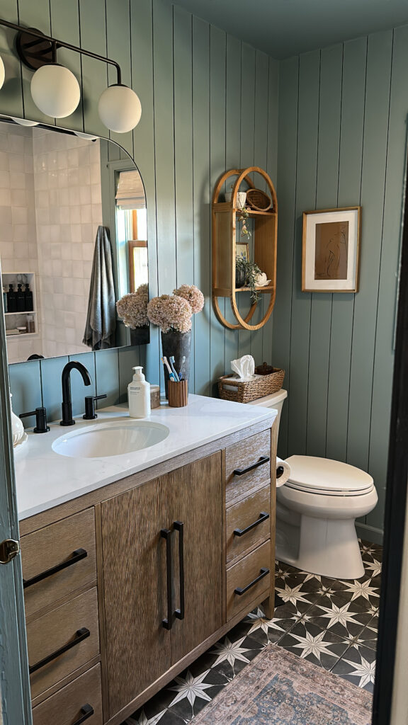
Provence Blue – Behr
Our bathroom renovation was a three year labor of love, so I needed to make sure the paint color I chose for the space was perfect. I had picked up the paint chip for Provence Blue a few years before because I thought it looked like such a dreamy, cozy color. When it was finally time to paint the bathroom, I grabbed a sample of it along with a few other similar colors, but had a gut feeling it would be the one. I was right, and this color is so good I even color drenched the ceiling. It’s hard to really get an accurate picture of it, and I’ve had people comment when they come over how it looks good in pictures but is even better in person. If you’re looking for cozy and calming, this is a winner.
My Wildcard Color
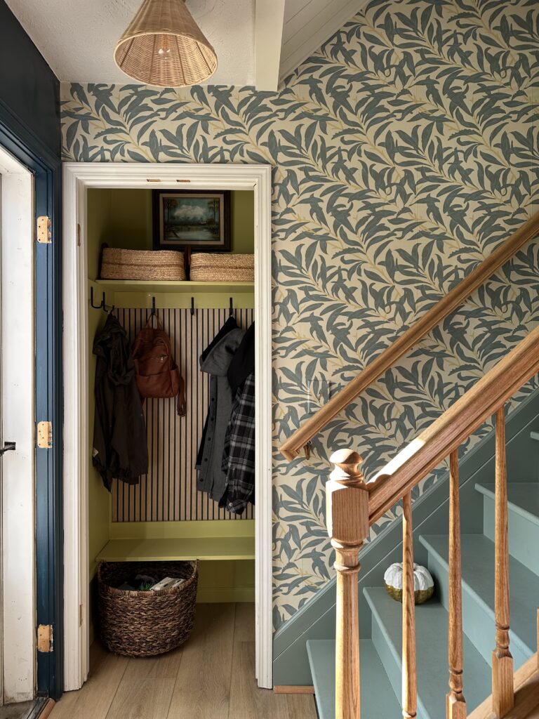
Independent Gold – Sherwin Williams
I had the paint colors for my stairs and ceiling in my stairwell color matched to the wallpaper here, but decided to wing it with the gold color in the pattern for the entry closet at the base of the stairs. I took a piece of the wallpaper to the store and thought the Independent Gold paint chip looked like the closest match. I committed, grabbed a quart of it, and brought it home to paint! And sometimes I like it and sometimes I don’t. It changes drastically with the light and looks a bit too much like lime green a lot of the time.
Those are the paint colors I’ve used so far in the rooms I’ve renovated in our home! But I may need to make a part two at some point because I still have a bathroom, office, and kitchen that all need a makeover!